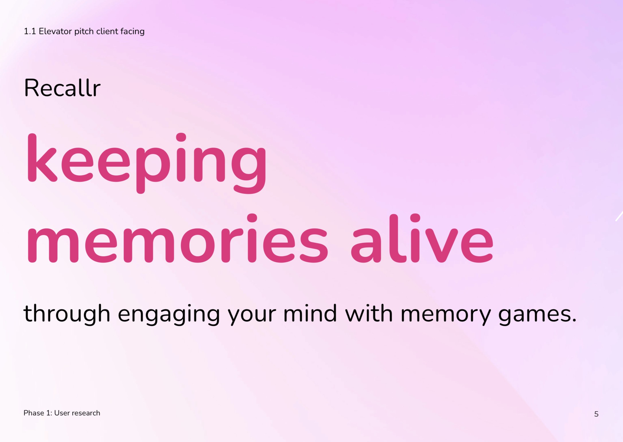
Recallr app prototype
Recallr app prototype


Designing packaging that reflects the essence of the I AM album, exploring the vinyl use of typography and possible ways of enhancing and creating more of an experience with the gatefold sleeve and inner sleeves.
Designing packaging that reflects the essence of the I AM album, exploring the vinyl use of typography and possible ways of enhancing and creating more of an experience with the gatefold sleeve and inner sleeves.
RECALLR PROTOTYPE
Process
The development of Recallr was driven by a user-centred design process, beginning with in-depth user insight interviews with individuals who have family members living with Alzheimer’s. Alongside this, I conducted a competitor analysis of existing memory and health apps. This involved evaluating their strengths and weaknesses.
RESEARCH IMPACT
My research had a clear impact on Recallr's final design. Through interviews with people who have family members with Alzheimer’s and looking at existing apps, I found that most tools focus on basic reminders but lack motivation and meaningful engagement.
This led me to focus on helping users stay consistent and see their progress. Recallr includes a stats page that shows activity over time, encouraging continued use and highlighting small wins.
See below for a document of my full process.
Process
The development of Recallr was driven by a user-centred design process, beginning with in-depth user insight interviews with individuals who have family members living with Alzheimer’s. Alongside this, I conducted a competitor analysis of existing memory and health apps. This involved evaluating their strengths and weaknesses.
research impact
My research had a clear impact on Recallr's final design. Through interviews with people who have family members with Alzheimer’s and looking at existing apps, I found that most tools focus on basic reminders but lack motivation and meaningful engagement.
This led me to focus on helping users stay consistent and see their progress. Recallr includes a stats page that shows activity over time, encouraging continued use and highlighting small wins.
Process
The development of Recallr was driven by a user-centred design process, beginning with in-depth user insight interviews with individuals who have family members living with Alzheimer’s. Alongside this, I conducted a competitor analysis of existing memory and health apps. This involved evaluating their strengths and weaknesses.
RESEARCH IMPACT
My research had a clear impact on Recallr's final design. Through interviews with people who have family members with Alzheimer’s and looking at existing apps, I found that most tools focus on basic reminders but lack motivation and meaningful engagement.
This led me to focus on helping users stay consistent and see their progress. Recallr includes a stats page that shows activity over time, encouraging continued use and highlighting small wins.
See below for a document of my full process.
outcome
The final prototype successfully engages users by integrating their personal photos and music into key features, creating a more meaningful and personalised experience. The well-designed interface guides users naturally without instructions and helps users have an experience without any disruptions. The UI design uses colours which are known to be connected to brain engagement. These colours are used consistently throughout the app, within progress bars, illustrations and the main icon (brain maze). The app puts a focal point on congratulating users on their successes within the app and suggesting ways to improve their memory engagement.
Recallr's features
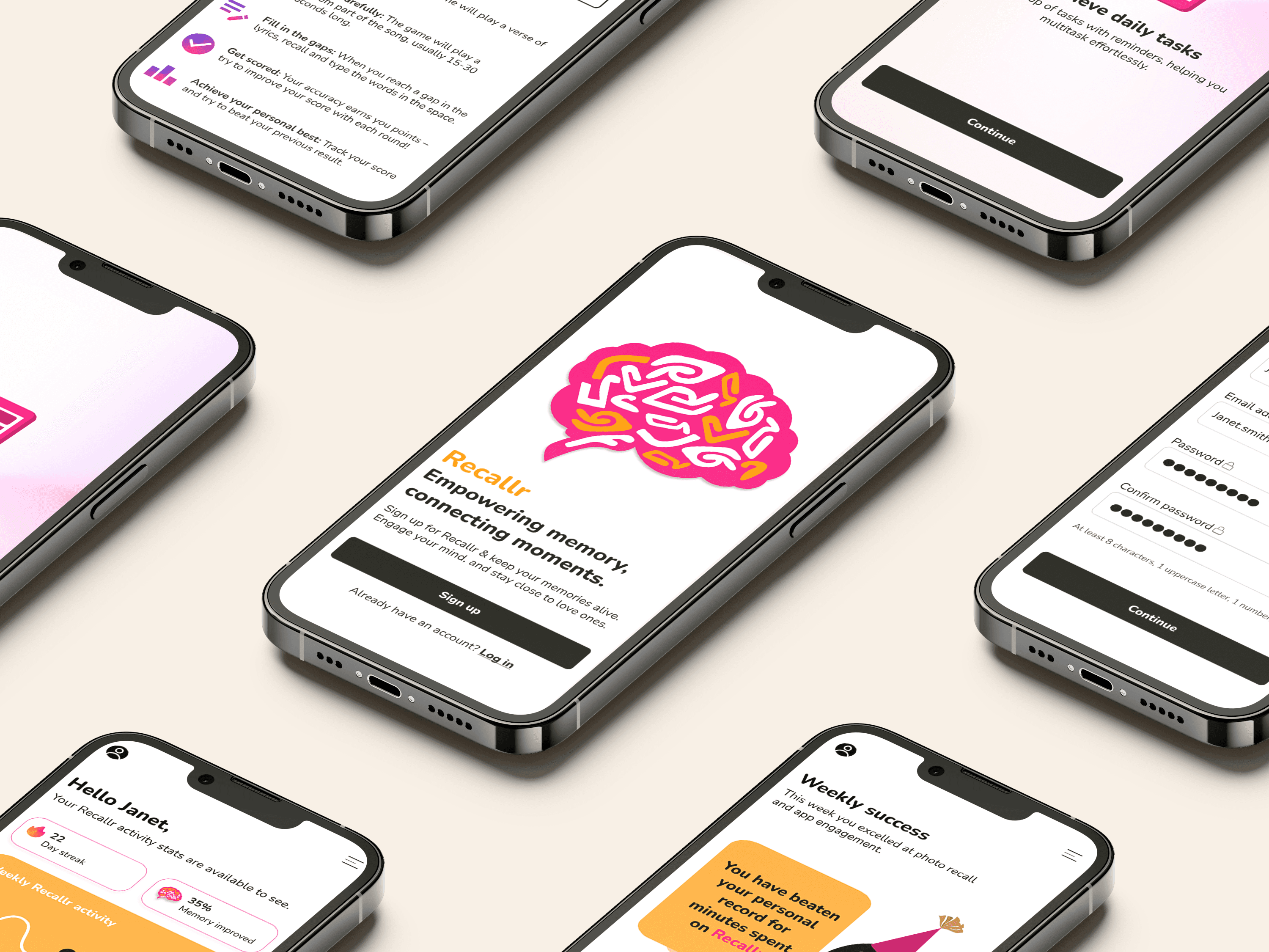
OUTCOME
The final prototype successfully engages users by integrating their personal photos and music into key features, creating a more meaningful and personalised experience. The well-designed interface guides users naturally without instructions and helps users have an experience without any disruptions. The UI design uses colours which are known to be connected to brain engagement. These colours are used consistently throughout the app, within progress bars, illustrations and the main icon (brain maze). The app puts a focal point on congratulating users on their successes within the app and suggesting ways to improve their memory engagement.
Recallr's features